Monday, 17 June 2013

Design of the Week (No.15)


Stir-ring my imagination this week is:

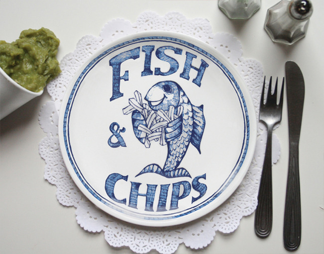
(No.15) The Traditional Chippy Mug and Plates by Home Slice Design

I may have lived in Essex for five and a half years now, but despite my propensity to swear in an Essex accent, I still class myself as a Northerner. I grew up on the North-West coast, a hardy part of England, where the Winters are cold and the Summers even colder. 


Growing up, one of the things I remember with great fondness was Tuesday evenings. Me and r'kid used to go for our swimming lessons followed by a chippy tea. Now having burnt mega calories whipping up and down the pool we were in need of a good feeding. So desperate we were when we turned up at our local fish & chip shop, that the women who ran it would take pity on us and give us a 'chip lolly' to keep us going. For those of you not familiar with chip lollies, it was essentially one of those plastic forks you could pick up on the counter with 3-4 chips stuck on it. This was ace, and helped us survive the five minute trip home without collapsing. 

So I was pottering around on the net the other day and I came across Home Slice Design, a design team "on a mission to create refreshing products that celebrate the overlooked, everyday Britishness and unsung domestic heroes of our time." What particularly caught my eye was their chippy range, so I thought I'd share it with you. I'll let Eleanor and Steph of Home Slice Design explain it to you:

"Everyone knows you can't beat a chippy tea on a rainy Friday night, with lashings of salt and vinegar and picking at the crispy bits stuck to the paper- one of the greatest pleasures in life. The Chippy range was created to celebrate these moments as well as all things fried and all things British." 


An awesome mug, I'm sure I remember this motif in my local chippy!

There are those chip forks, used to great effect on the bottom!

Yum yum... mushy peas (left top)

A selection of some of their other plate designs


The mug retails at £15 and the plates are £25 each. Check out Home Slice Design's website for more details: http://www.homeslicedesign.com/

Thank you Home Slice Design, for bringing back such happy memories. I think I'll be making a small purchase ;-)

Monday, 29 April 2013

Design of the Week (No.14)

Stir-ring my imagination this week is:

(No.14) The Igloo Ice Cube Container by XD Design


This one is wonderfully silly, the Igloo Ice Cube Container does exactly what it says on the tin, it's an igloo that contains ice. But not content with merely being a glorified ice bucket, this igloo also has a silicone top for freezing ice in too! Some designer at XD Design had great fun dreaming this up...


...but wait, there's one more trick up it's sleeve, you can use the door at the front as a set of tongs to remove your ice! Ha ha, bonkers!


Is this a pointless novelty item or does it really work? I don't know if I can answer that. I certainly love the principle of it, but can't help thinking it's trying to do a little too much. I don't imagine those tongs are the easiest things to use, but I might be wrong. I'm also looking at the shape of the ice-cubes in the lid and thinking they perhaps they missed a trick. How cool would it be (excuse the pun), if the ice cubes were shaped like igloo blocks? What I mean by that is that they are curved so you can create your own igloo from real ice? Sod the drinks, I just want to play with the ice!

Nice. 


Thursday, 21 March 2013

Design of the Week (No.13)

Stir-ring my imagination this week is:

(No.13) The Kikkerland Drowning in Debt Salt and Pepper Shakers by S
ebastian Errazuriz

I thought this was highly appropriate for Design of the Week number '13'. This poor little fellow is up to his eyeballs in salt. 


Designer Sebastian Errazuriz (great name) says of his product:

"Like so many of us, these two humble workers have found themselves buried under an inescapable debt. Whether its debt or unemployment, these two little salt and pepper shakers humbly attempt to represent the struggle that is the sign of our times." 


"As soon as the seasonings are used the two workers slowly emerge, only to find that they will soon be covered again."

A bit arty farty for my liking to be honest, but I like the idea behind it. When I first saw it I thought it was representational of some gangster mob torturing a victim... that's a bit cooler really isn't it?! (well, not for the victim!).

The other thing that is slightly weird is that you save the little man as you use up the salt (or pepper), it's a shame it doesn't work the other way around. It's like debt consolidation I guess!?

I'd like to have seen Indiana Jones in the pepper one, with his whip up in the air trying to escape a pit of quicksand! Maybe I'll save that for the Stir™ range if someone doesn't pinch the idea from my blog ;-)

The Kikkerland Drowning in Debt Salt and Pepper Shakers retail for around £16.50, a bit too much I think. Still, great fun!

Monday, 18 March 2013

Design of the Week (No.12)

Stir-ring my imagination this week is:

(No.12) Fred and Friends Mr. Tea Infuser

This week I begin my look at tea infusers. For a product that you would have thought had become somewhat redundant since the introduction of the teabag, there are a remarkable number of designs on the market. And not only that, there are some really quirky and, dare I say, outlandish, designs! So much so that I suspect this won't be the first tea infuser making it into design of the week.

To kick things off, I bring you the 'Mr.Tea' Infuser (no relation to the ex-special forces, Mandinka hair-styled, plane fearing, 80's tough guy!). 


This little dude sits on the side of your tea cup / mug and infuses boiled water through his pants! An extraordinary talent, I hope you'll agree! I love the way he's posed so that he looks comfortable both inside the cup and slumped up against the outside of the cup. It's enough to make me want to buy my tea loose! 

Mr.Tea retails around £7. I want one :-)

Monday, 4 March 2013

Design of the Week (No.11)

Stir-ring my imagination this week is:

(No.11) Clear Hive Honey Set by Biodidactic

This weeks Design of the Week (ish month) is a pot for your honey. What's lovely about this design is how it has taken inspiration from nature. The glass pot itself is shaped like a honeycomb and the dipper inspired by a bee's backside! 


Now I have a lot of time for bees, they do a wonderful job for mother nature. We get quite a few bees in Essex and I'm always keen to stick some lavender in the garden for them and buy honey from our local farm shop. For those of you who are not great lovers of honey, you should be. There are so many different varieties and flavours you're missing out!

Anyway, back to design. The Hive Honey Set is available in clear and frosted glass and retails around the £35-50 mark. Not cheap, but you're buying a piece of art and that glass design is not the easiest to manufacture. Love it!

Friday, 1 March 2013

Chasing the Holy Grail

When I was growing up all I wanted to do was draw. I'd find myself a quiet corner, grab a pencil and scribble away for hours. I loved the creative freedom I had as a child to create whatever I wanted, no holds barred. It didn't matter what it looked like, whether it was in perspective, if it was even in the right colour, because my imagination did the rest.

The older I got and the more I progressed through school, the more serious art became. I now wanted things to look as close to real life as possible. I spent years honing skills with paintbrush and pencil always striving perfection. 

Then I went to university to study design and my style had to change. Lose, free and most importantly, fast, was the order of the day. This didn't suite my cack-handed lefty pencil grip and I found it really difficult. When your thumb overlaps your forefinger and your wrist twists inwards it doesn't lend itself to producing long, sweeping lines! We also used a lot of marker pens, again designed for speed. 

And then it all changed. Computers took over. Why spend 6 hours doing a hand rendered illustration when you can produce it in two hours in a spectrum of colour combinations? Why use tip-ex (remember that?!) on an engineering drawing when you can easily alter your measurements in CAD (Computer Aided Design)?

Ironically, by the time I reached professional design, the pencil was dead. I can honestly say, in 6 years in the profession, I have barely done a hand draw illustration. Yes, scrappy sketches in a notebook to communicate an idea, but nothing more. Nowadays I draw in Photoshop, Illustrator and 3D CAD software. What is startling is that my chiropractor now tells me my right hand is now stronger than my left from all the mouse work! I have software that tracks my movements - yesterday, in approximately 7 hours, I moved my mouse 50 meters and clicked over 11,000 times! Is it any wonder I have RSI problems?!

So what am I getting at with this little story? Well, this week I bought some new rendering software - KeyShot 4. It's used to 'colour in' my 3D models. I've not updated my rendering software in years (probably 10 years!!) and I was truly astonished at A; How easy the new software is to use (no messing about with complex lighting setups), and B; How fecking ace it looks!! 


The 'Juicy Cactus', a lemon squeezer I designed
and rendered in KeyShot 4.

I think I am finally getting close to the holy grail; a photo realistic visual / illustration, that can trick the viewer into believing it is a photograph. This, I guess, is something, I have been pursuing since a was a kid. Being a perfectionist can be useful as a designer, but it can also be a sin. Thankfully, this new software is making the perfectionist in me a little easier to deal with! :-)


A stationery set, also rendered in KeyShot 4

Tuesday, 5 February 2013

Design of the Week (No.10)

Stir-ring my imagination this week is:

(No.10) Wine For Your Life - Wine Bottle Opener

Hello all, this week a bring you a wine bottle holder. Artori Design (based in Israel) have come up with this ingenious design for holding your wine bottles. A silhouette of a man and women can be seen running away from a falling object - the object being your wine bottle!


The brilliance of this product is it's simplicity, from a perspective view point (shown below) you can see just how simple the design is. It's just one sheet of metal, cut and bent in to shape and coated black. It reminds me of Godzilla, I love the way you can see the movement in the man's tie and the woman's hair!


Artori Design do loads of other great designs around this theme, but I think I'll save one or two for future posts! A special mention too for the name 'Wine For Your Life', great pun!

I've seen this design retailing between £12-18.